
Me in vintage Azzuri 1992 : King Kevin / my first football kit 1984 : Me (back left or left back if we're using football terms!), my brother (back centre...I'll resist...) and friends in Monaco, UEFA Cup 1997
There were two things that inspired the project, firstly a trip to the design museum to see an exhibition named designing the beautiful game (very inspirational, actually / obviously!) which explored the role of design in football, from the stadium to the boots, though what interested me most was the kits and the crests.
Secondly a book that my brother gave me called World Football Club Crests which similarly explored the reasoning behind the branding, dissecting club crests and finding the symbolism of each element.
Being a graphic designer by day, these two things left a big impression on me and made me look at all elements of the match day differently, looking at the programme and thinking how I would do it differently, looking at the stadium signage and thinking how I’d make it more clear and ultimately looking at the kits and crests and wondering how the designers arrived at that design and given a chance how I would design it myself.
These thoughts became an obsession and I began drawing ideas for kit concepts before arriving at the conclusion that the greatest clubs on the planet were unlikely to allow someone who specialises in designing drinks brand labels to have a go at their new kits.
What I could do though was look back through my own collection of shirts dating back to the 80s, my first being the silver Newcastle away shirt that Kevin Keegan wore (pic below unless I forget to add it) and see how I would reimagine them in my own style as a series of t shirts and sweatshirts.
I’ve always been a fan of geometric, linear, brutalist design which I’ve brought into these designs, whilst stripping back the layers to create clean simplistic style which emphasises the meaning of the key elements.
The first design I reimagined was the classic Glasgow Rangers 1988 shirt, I loved that as a kid, the shimmering fabric and checkered design, I worked this as a duotone layered check with varied sizes to reflect the shimmer with a stylised linear crest. I’ve reimagined the crests in a way that is sympathetic to the original whilst balancing the linear shirt designs, a brutalist love affair with the beautiful game which hopefully doesn’t infringe on any copyright!
I’ve simplified the manufacturers logo where it seems appropriate and adds to the overall design whereas in others they’ve been left out, again they are just reflective of the original and do suggest any brand involvement.
Most of these designs are a reimagining of old shirts from the 70s, 80s and 90s when they just seemed to do things better without overcomplicating, whilst anything more recent I’ve stripped back to remove the layers of complication.
The shirts and sweatshirts have been methodically sourced and sampled, they are printed and distributed in the UK. The garments are of premium quality, heavy cotton, classic fitting and printed with high end Mimaki UCJV300 printers and inks.
I myself am a collector of football shirts, a football tourist and a supporter of Newcastle United with a soft spot for PSG having lived in Paris for a long time.
I hope you like what I’ve done, it’s a labour of love that has sat dormant for years until I finally summed up the courage to make it a live project.
If there are any shirts you’d like to see that aren’t on the site drop me a message and I’ll give it a go.

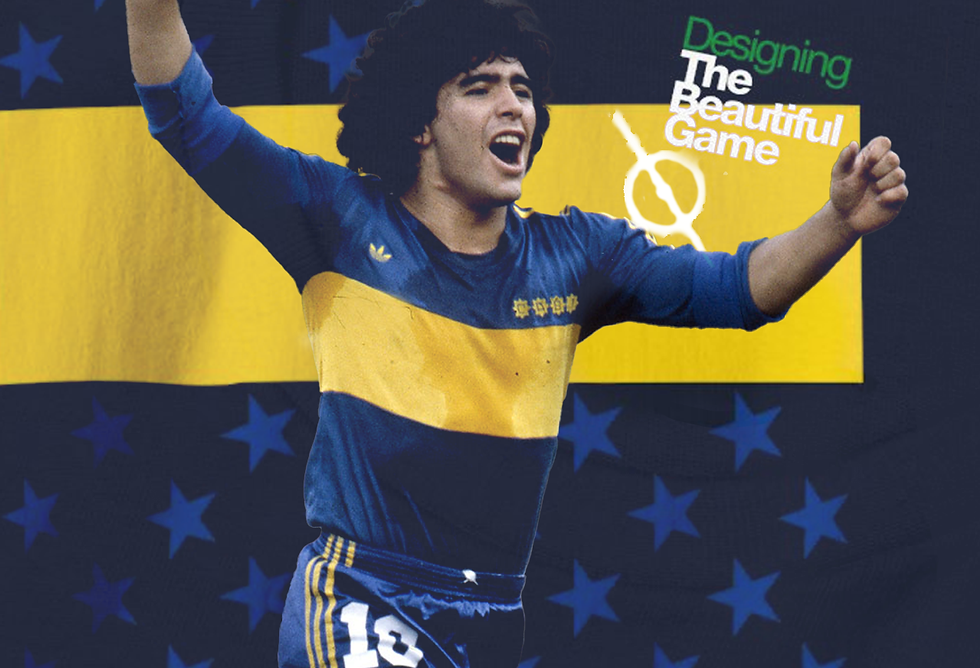
Designing The Beautiful Game